Selling your products or services becomes a heck of a lot easier when your brand identity clearly defines who you are and what you care about and speaks directly to the people that you want to connect with.
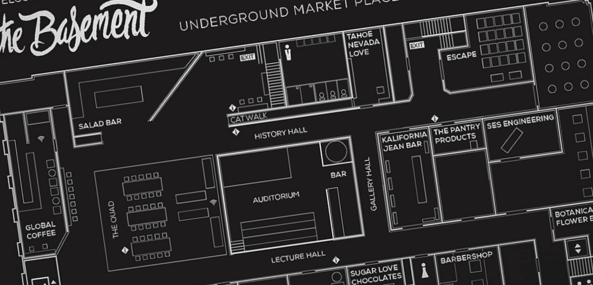
The Basement aimed to transform a historic United States Post Office from the 1930s into a vibrant community hub in downtown Reno. The challenge was to create a cohesive branding strategy that could unite diverse tenants, including a clothing boutique, salad bar, juice bar, and other shops, while honoring the building’s historical significance. Commence Studio partnered with The Basement to bring this vision to life, blending modern aesthetics with the rich history of the space.
Reno, NV USA
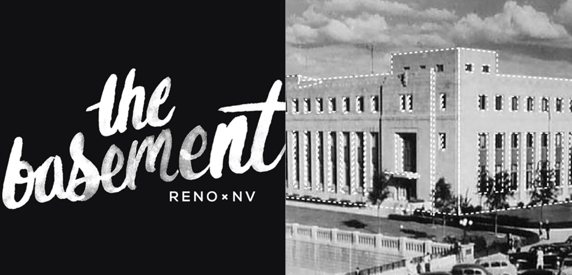
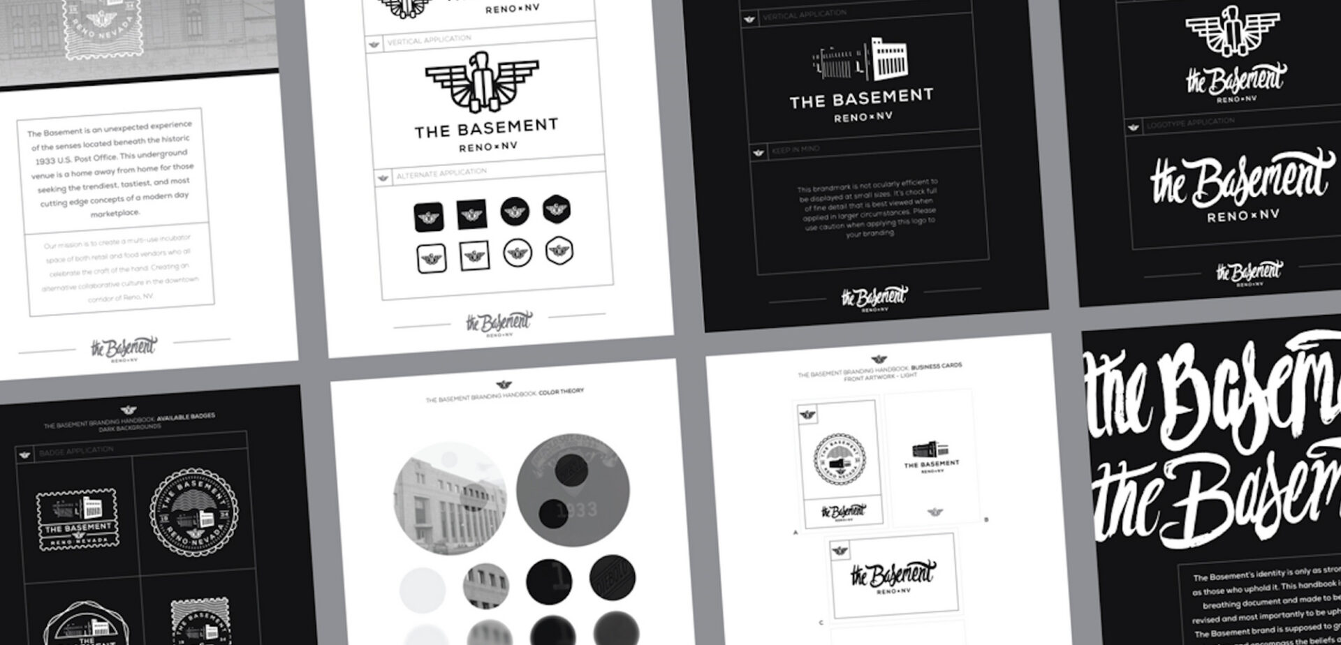
The Basement aimed to transform a historic United States Post Office from the 1930s into a vibrant community hub in downtown Reno. The challenge was to create a cohesive branding strategy that could unite diverse tenants, including a clothing boutique, salad bar, juice bar, and other shops, while honoring the building’s historical significance.
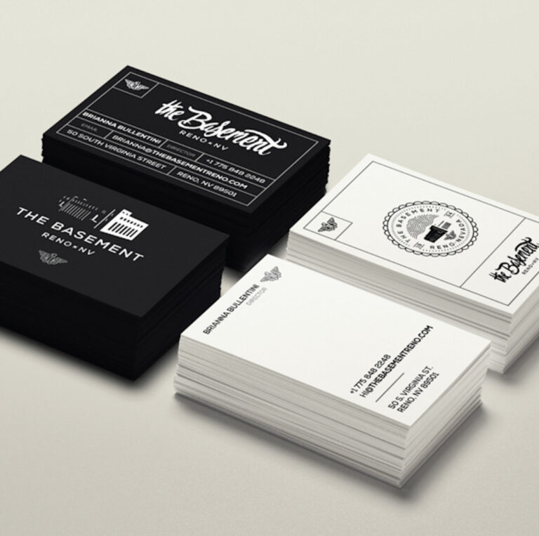
Creating Community Through Local Renovation Lead Designer Brianna Bullentini approached Commence Studio to take charge of the creative direction and branding. Her vision was to create a community hub where people could gather, shop, eat, drink, and enjoy themselves. Our goal was to reflect the history and strength of each individual shop within the space while fostering a sense of unity.
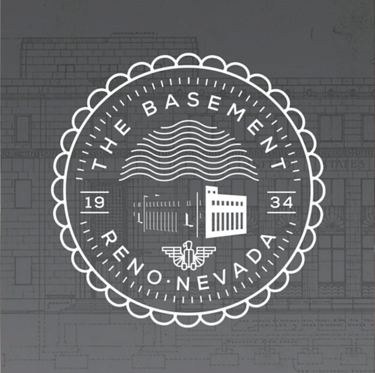
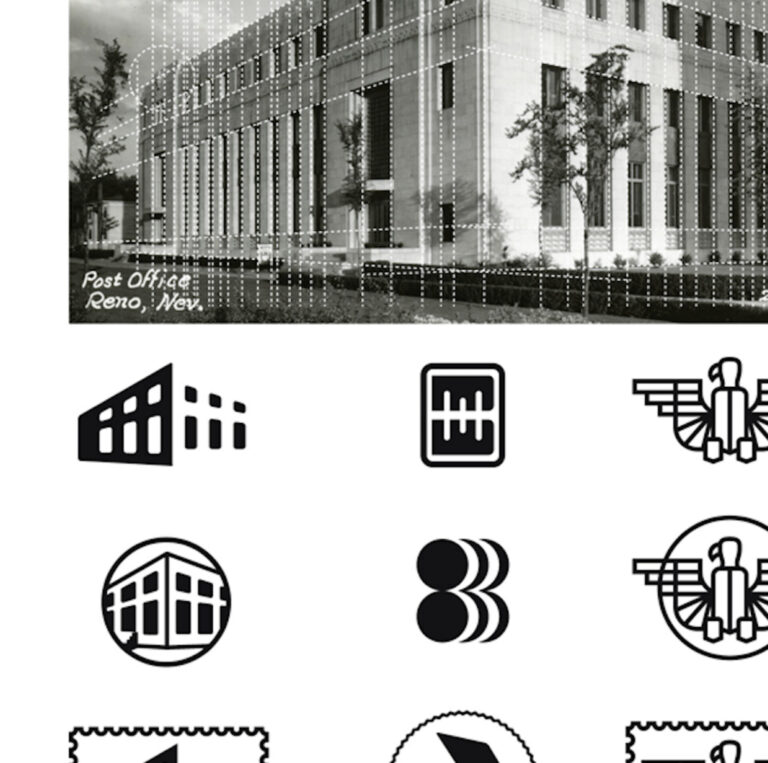
Emphasizing Natural and Historic Elements We identified the common thread among all the different shops: their unique location within a historic building. Our strategy focused on highlighting the building’s natural beauty rather than covering it up. Using the shape of the building and incorporating hand-lettered details, we created a logotype that was modern yet drew from the building’s original historic elements.
Modern Yet Historic Logotype The design incorporated hand-lettered details and linework throughout the space, providing a contrast of clean, modern aesthetics alongside the historic setting. This approach created a distinctive and memorable identity that resonated with the community.
A Thriving Community Hub
Three years since its inception, The Basement has become home to numerous local boutiques, retail stores, and even a gym. It successfully captures Bullentini’s vision of a gathering place for the community, celebrating life and local culture.
Bold and Edgy Design For Rawbry, we created menu designs and bottle packaging reflecting their bold style. We also developed store signage, including a neon sign, print collateral, and redesigned the bottle to be more economical and sustainable as the brand grew.
Unique and Fashionable Products We helped Tahoe Nevada Love create products that reflected their love for Lake Tahoe, including warm winter lines, bright beach attire, drinkware, backpacks, and adventure gear.
Sophisticated and Welcoming Identity Chomp’s branding and identity paid homage to the post office’s architect, Frederick J. DeLongchamps. We combined sophistication and structure with warm and welcoming vibes, focusing on quality, organic, and local food. The menu, print advertisements, and promotional assets consistently showcased their clean and refined look.
The Basement case study showcases the power of strategic branding and design in transforming a historic space into a modern community hub. Commence Studio’s creative solutions provided The Basement with a cohesive and engaging identity, helping it stand out in downtown Reno and attract a diverse range of tenants and visitors.
Selling your products or services becomes a heck of a lot easier when your brand identity clearly defines who you are and what you care about and speaks directly to the people that you want to connect with.