Selling your products or services becomes a heck of a lot easier when your brand identity clearly defines who you are and what you care about and speaks directly to the people that you want to connect with.
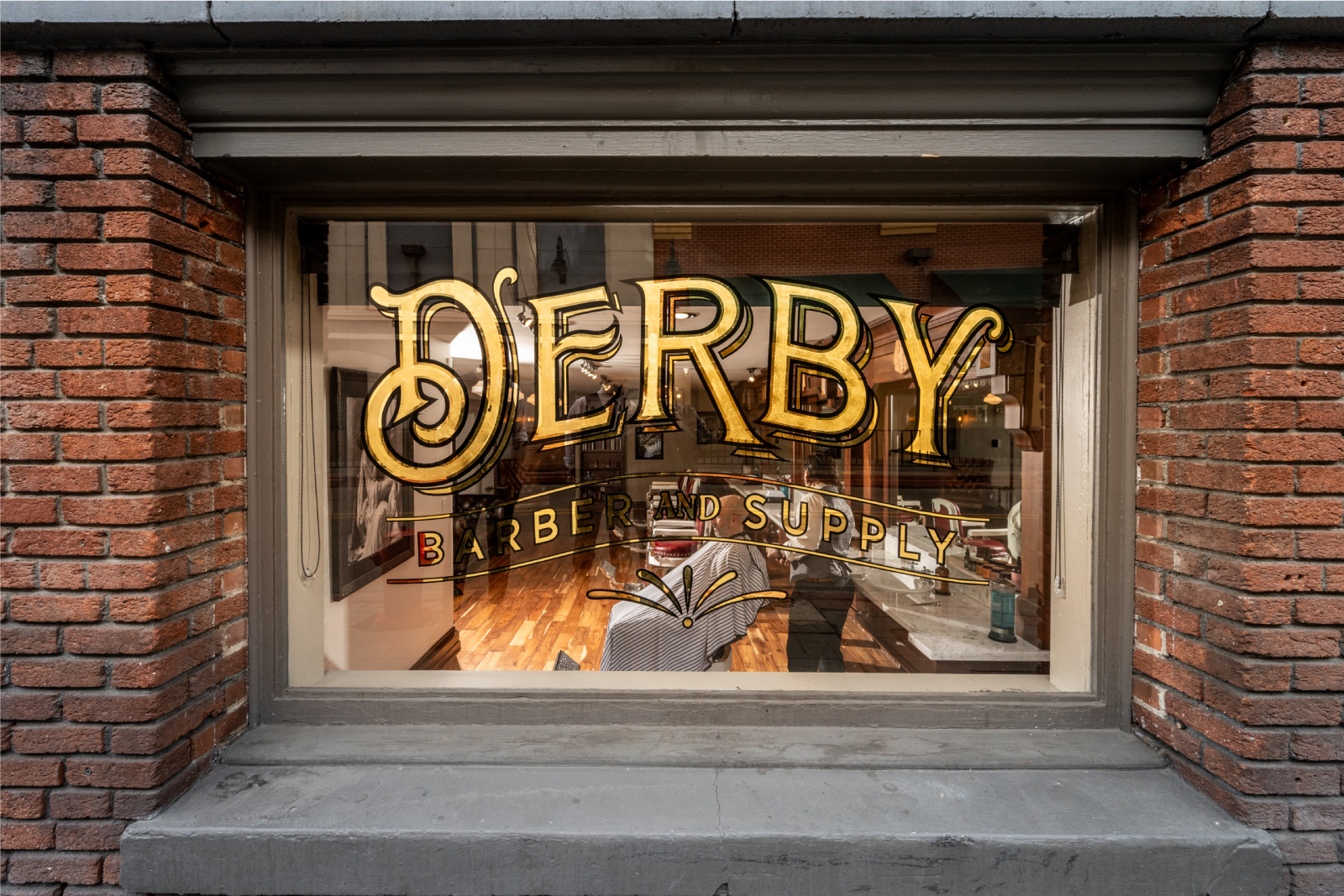
Derby Supply Co., now known as Derby Barber & Supply, is a barbershop and bar that had established a strong local presence in Reno, NV. To locals, Derby Barber & Supply. is known as one of the best barbershops in the industry. As they continued to become more successful and expand their business, their brand name and logo caused confusion by the moniker “Supply Co.”. Having previously collaborated with Commence Studio on another brand for their product line, Gravallese Co., Derby Supply Co. trusted that we were the right partner to help them create a unique new identity and corresponding website.
Reno, NV USA
A Fresh Fade For The Barber Shop
Derby Supply Co. faced challenges with its old branding and website. Their existing logo didn’t scale well, losing details and textures in smaller formats. The tagline “Fine spirits, finer services” caused confusion, leading some to think they were a wholesaler instead of a barbershop. This misidentification and the opening of a new location made changes necessary. The new location had a 40’s theme, while the old one had a 20’s theme, requiring versatile branding.
The outdated website posed another challenge. The cumbersome booking experience required multiple steps, causing many customers to call instead of booking online. Rebooking online was difficult for repeat customers, the barbershop’s most important clients, often leading to manual bookings at the front desk. This inefficiency highlighted the need for a more integrated and user-friendly solution.
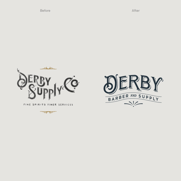
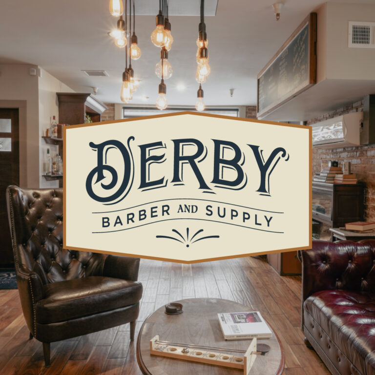
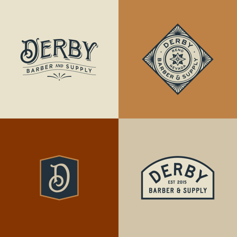
How do we balance boldness with scalability in brand identity? We tackled this by crafting a dynamic tagline: “Barber and Supply.” We spotlighted “Derby” while minimizing “Supply Co.” prominence. The result? A bold icon clear even at favicon size.
Terracotta, dark blues, and brass. Masculine colors that make a statement. This palette wasn’t just aesthetic—it was intentional. Our new branding system allowed for unique variants at each location while ensuring consistency.
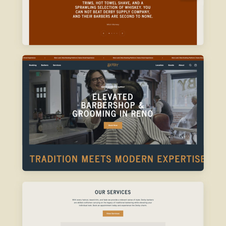
A website should tell a story, right? We enhanced the atmosphere with photos and videos, immersing visitors in the experience before they arrive. Switching from SquareSpace to Shopify Online Store 2.0 offered more flexibility in content and merchandising.
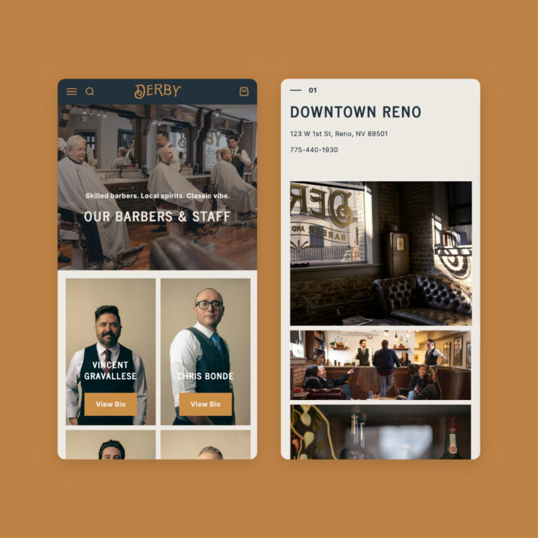
We didn’t stop there. We put the barbers front and center, showcasing their skills and sharing their bios. Clients could know their barbers before even stepping in. With a clear call-to-action, booking became a breeze. We also upgraded the site to sell products online, leveraging excellent reviews, transparent pricing, and integrated services. By incorporating Squire, we streamlined booking and improved the user experience. Multiple locations? No problem.
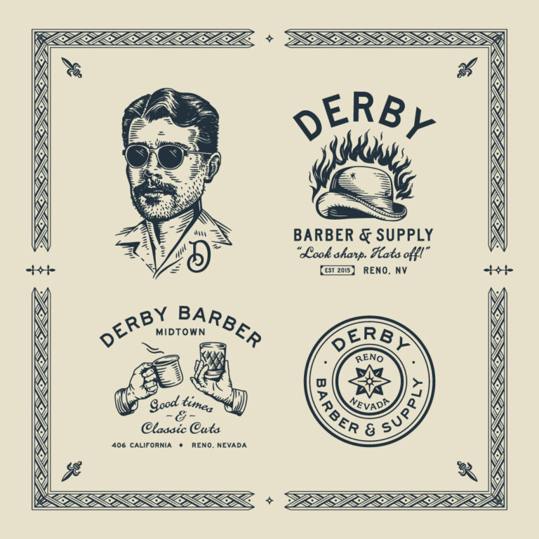
Why not make branding fun? We designed hand-drawn illustrations for various service lines, creating themes for the old and new shops. This added a playful touch to the brand, fostering unique merchandise opportunities and solidifying brand identity.
Despite strong initial SEO, our redesign and platform shift boosted website traffic and engagement. This wasn’t just a numbers game; it was a quality leap. The enhanced user experience and integrated solutions pushed Derby’s online presence to new heights.
Bookings jumped by 25%. Organic traffic surged by 20%. Numbers that speak for themselves.
Selling your products or services becomes a heck of a lot easier when your brand identity clearly defines who you are and what you care about and speaks directly to the people that you want to connect with.