Commonly found inside design teams and marketing departments, the benefits of a design system are plenty. Do you want to understand the benefits behind them and even create one for yourself?
You’re in the right place. As a creative agency with years of experience building scalable brands, we’re uniquely positioned to help.
So, without further adieu, what is a design system, and what are the advantages of having one? Read on to find out.
What is a Design System?
Simply put, a design system is a set of reusable components that can be put together for different purposes. Brand systems often go hand-in-hand with a style guide that shows how the assets can be used and why. The purpose is to give brands consistency in user experiences across their channels and to streamline the marketing process.
For example, a design system may include:
- Company logo
- Pattern library
- How-to of your own design process
- Documents on the brand philosophy
- Functional elements – forms, menus, buttons, etc.
Why are Design Systems Important?
Design systems are important because they streamline your design process and improve user experiences. It also means that when you need to outsource design and marketing, you can simply send across your design system package to make the job quicker and easier.
Imagine this, your company recently rebranded, overhauling its logo, colors and mission statement.
First off, congratulations on the rebrand! Now comes the task of implementing that brand across social media, website, promotional materials and even internal documents. If you task your in-house graphic designer with creating all new materials with your new brand it could take them one year and a lot of stress.
With a design system, you have the ability to elicit outside help to implement the new brand across every channel a whole lot quicker.
That saves time, money, and sanity.

Components of a Design System
Design systems can vary depending on the organization. For consumer packaged goods (CPG) companies you might find label designs in their design systems while a tech company might include when and how to use specific illustrations. Things like the industry and mediums a business uses can shift the components of a design system. That being said, here are some common things you might find across the board.
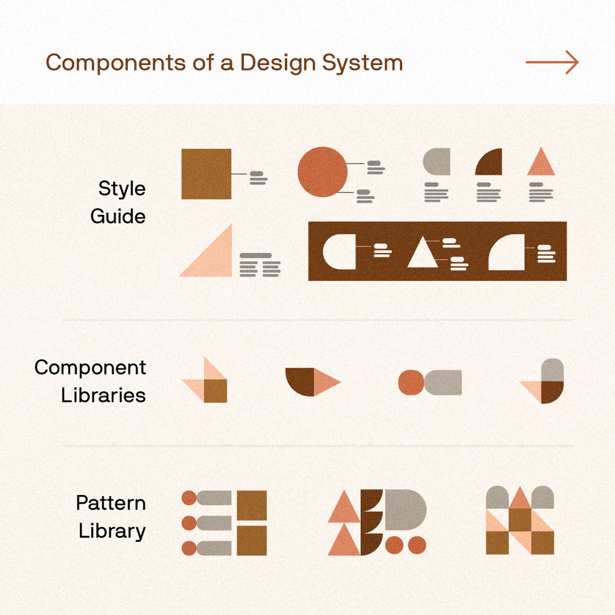
Style Guide
A style guide is the documentation of how you want your brand to show up in the world. It’s an end-to-end document that’s used internally and externally to help employees and partners know exactly how to represent your brand when sharing it in digital and print pieces.
A style guide has multiple elements, which can be divided into two sections:
- Your brand story – This is the heart and soul of why your business was created and why your customers connect with you. It includes your mission, vision, core values, and brand voice.
- Your visual identity – this can include a logo, color palette, typography, imagery, illustrations, buttons, print ads, and more.

Component libraries
A component library is a tool that’s often shared between designers and developers. It’s a collaborative project where an in-house team can create reusable UI elements to be used and repurposed throughout the development process. As you can imagine, creating this library can take time but once completed, it is easier to maintain your brand when developing new web pages or components for other technologies, like a company app. Each component should have:
- Component name: must be unique
- Description
- Attributes: can color, size, shape, copy, etc. eb changed on the component? Then it should be listed
- State: recommended defaults and changes in appearance
- Code snippets: the actual code excerpt for the element

Pattern Library
Pattern libraries feature collections of UI-element groupings or layouts. Pattern libraries are often thought of as less robust compared to component libraries, but they can be as thorough or as high-level as needed. They typically feature content structures, layouts, and/or templates. Much like the components, the patterns are meant to be reused and adapted.
Pattern Library vs. Design System
If you’re familiar with marketing terms, you might think it sounds like a design system is the same as a pattern library. This isn’t far from the truth, but there are some key differences:
A pattern library consists of groups or collections of UI elements, typically ones you’d use together regularly. For example, a pattern library might include a page layout with banners, buttons, dividers, and more that you can use whenever you need to generate a new page.
A design system, however, features these UI elements separately along with other assets. You’ll find a pattern library in a design system as one of these elements, though.

Benefits of a Design System
The benefits of a design system can be broken down into 2 main elements:
1. Consistency and Functionality
Having a toolkit of assets means (in theory) anyone can design for your brand while keeping the look and feel the same no matter the medium. Consistency is vital in brand identity, and having a design system library makes the design process quicker and easier. That being said, when launching a new campaign design like Defending the Rubies from Patagonia we’d recommend reaching out to professional campaign designers.
2. Improves User Experience and Interface
From a designer’s perspective, having pre-made user interface elements makes their job much easier. It becomes a case of selecting what they need from the pattern library and assembling them into the end product. Scalable design systems mean you can grow your digital products when needed with much less effort.
But this also helps user experiences. Ideally, a client shouldn’t notice your company’s design system assets because this means you’re using them correctly. Style guides help here – they allow you to create consistent elements that lead to positive user experiences.
How to Create Your Own Design System
To create a design system that can be scaled, you’ll need to round up all of your brand assets and create a document that encompasses it all.
First, review your company’s visual elements and build a catalog of UI components and design elements to form the foundation of your design system. You can also identify inconsistencies that have emerged like colors outside of your palette or even improper use of your logo. *gasp*
Second, set up clear principles on how you think about your product and create a set of guidelines for how you’ll bring them to life. Design principles lay out the branding vision for your product, including how you want customers to feel while using it. Do you want customers to feel calm? Excited? Curious? Do you want your brand to feel friendly? Quirky? Cerebral? Your design system should outline how you can make customers feel the way you want with your design.
Third, take the catalog of visual elements from step one and the principles from step two and compile them into one handy resource and distribute it to your team.
Be sure to document what to do if someone finds an inconsistency in your design system and the process to follow to update your design library.
In theory, once you’ve gathered all this information, you’ll have the basic elements of a design system. From there, it’s simply a case of collecting and organizing the assets so they’re helpful for future designers.
Final Thoughts on Design Systems
Scalable design systems are the backbone of a company’s branding and user experience. While you can build your own from existing elements, it makes sense to get a dedicated design team on board.
So, if you’d like to create a design system for your business and need some help, contact us at Commence Studio. We help purpose-driven brands get ahead of the competition, and an effective design system is the first step on this journey.

