Selling your products or services becomes a heck of a lot easier when your brand identity clearly defines who you are and what you care about and speaks directly to the people that you want to connect with.

Hey Hey’s Fried Chicken, a vibrant food truck in Reno, partnered with Commence Studio to create a brand identity that stands out in a crowded market. Our goal was to design a visual identity that pops off the page and a user-friendly website that makes it easy for customers to locate the truck and place orders.
Reno, NV USA


Hey Hey’s needed a unique and eye-catching brand identity to differentiate themselves from other food trucks. Additionally, they required a website that was easy to navigate, allowing customers to find their location and menu while standing in line.


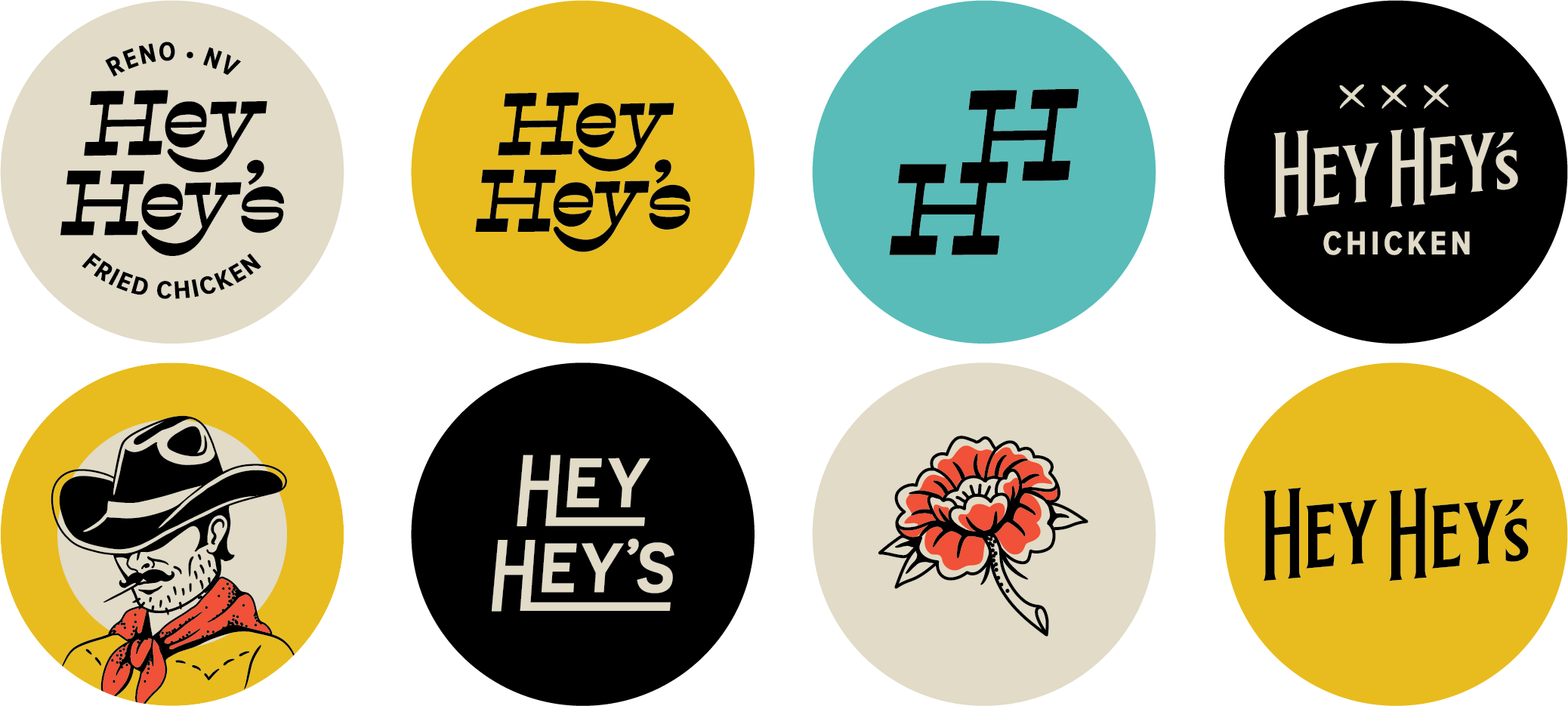
Inspired by the Old West and Traditional Tattoos Commence Studio created a brand identity for Hey Hey’s Fried Chicken inspired by the old west and traditional tattoos. The hand-drawn illustrations featured iconic elements such as cowboys, roses, chickens, and horses. These illustrations were set against punchy backgrounds, making them stand out in a crowd of food trucks and helping Hey Hey’s gain a cult-like following.
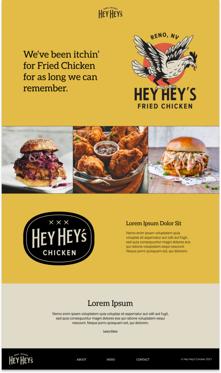
Illustration in Web Design To translate Hey Hey’s visual identity from the streets to their online presence, we built their website on Sanity.io, a content management system known for its ease of use and customizability. The website design perfectly paired with the illustrative brand elements, creating a cohesive look. The user-friendly interface made it easy for customers to learn about the pop-up, check the menu, and find the truck’s location. The site was built with user experience in mind, ensuring quick and easy access to information essential for a pop-up food truck.
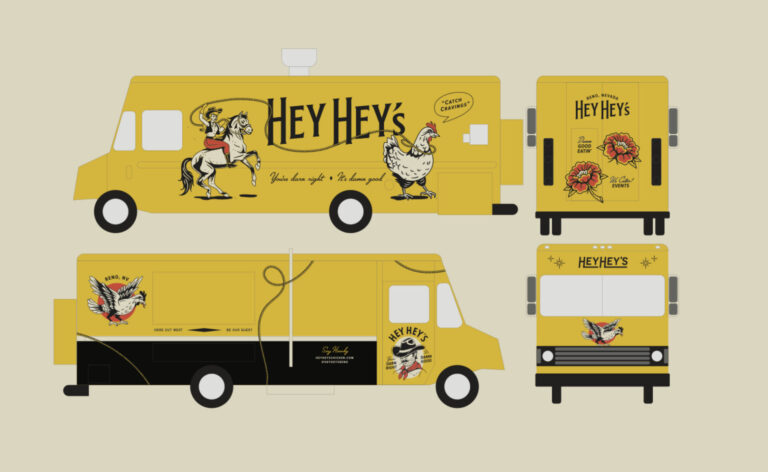
Standing Out in High-Traffic Events Food truck events in Reno are high-traffic opportunities to connect with customers. To ensure Hey Hey’s Fried Chicken stood out, we utilized their illustrative brand identity on the food truck itself. The bold visuals grabbed patrons’ attention, encouraging them to choose Hey Hey’s fried chicken over other options.
Gaining a Cult-Like Following
The bold and unique brand identity designed by Commence Studio helped Hey Hey’s Fried Chicken gain significant recognition and a loyal customer base. The distinctive illustrations and engaging website made it easy for customers to find and connect with the food truck, enhancing their overall experience.
Enhanced Visibility and Customer Engagement
The new brand identity and user-friendly website significantly improved Hey Hey’s market presence. The eye-catching illustrations and easy-to-navigate website attracted more customers and facilitated better engagement, ensuring that Hey Hey’s Fried Chicken stood out in a competitive market.
Selling your products or services becomes a heck of a lot easier when your brand identity clearly defines who you are and what you care about and speaks directly to the people that you want to connect with.