Selling your products or services becomes a heck of a lot easier when your brand identity clearly defines who you are and what you care about and speaks directly to the people that you want to connect with.

From its inception, Covered partnered with Commence Studio to develop a comprehensive brand identity, web development, illustration, and UI design. Based in Denver, Colorado, Covered’s mission is to simplify the insurance process. Our collaborative efforts helped Covered evolve from a startup to a fully-fledged digital insurance marketplace, culminating in their acquisition.
Denver, Colorado, United States
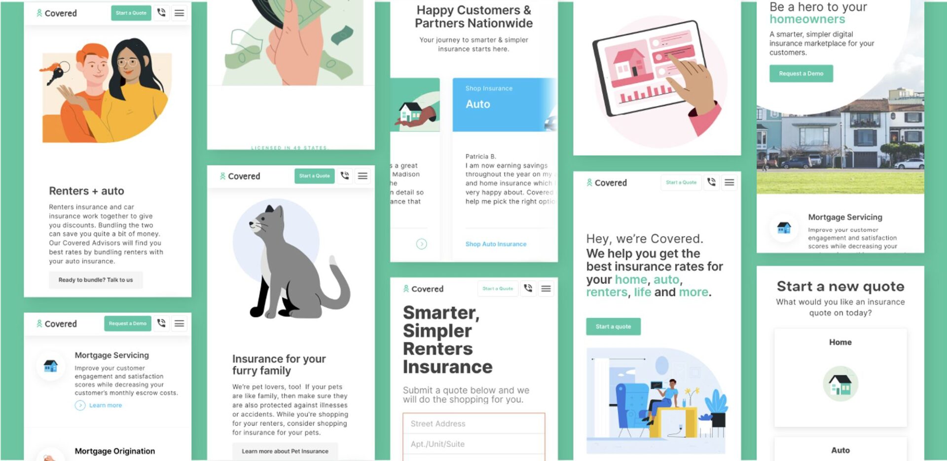
Covered sought to disrupt the traditional insurance shopping experience by creating a transparent and streamlined digital marketplace. They needed a brand identity that reflected support and stability, as well as an engaging and user-friendly online presence to convey complex insurance concepts simply and effectively. As Covered grew, they required a flexible backend system to support various types of insurance and a tailored experience for both consumers and business partners.
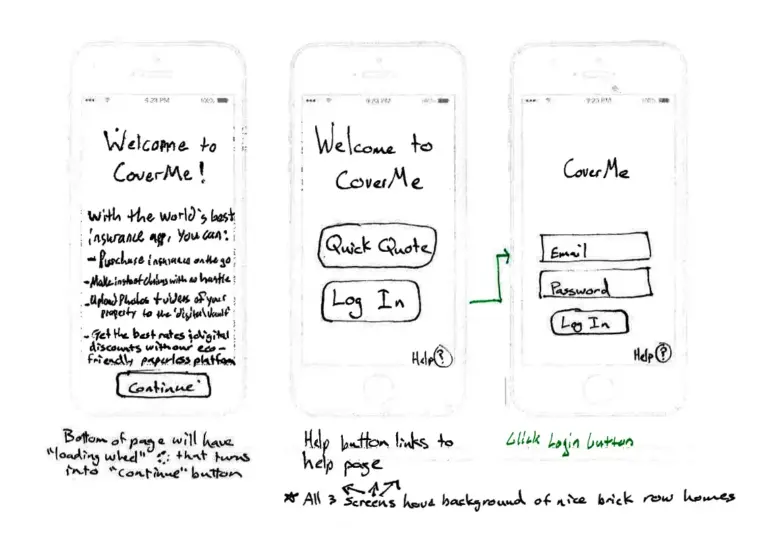
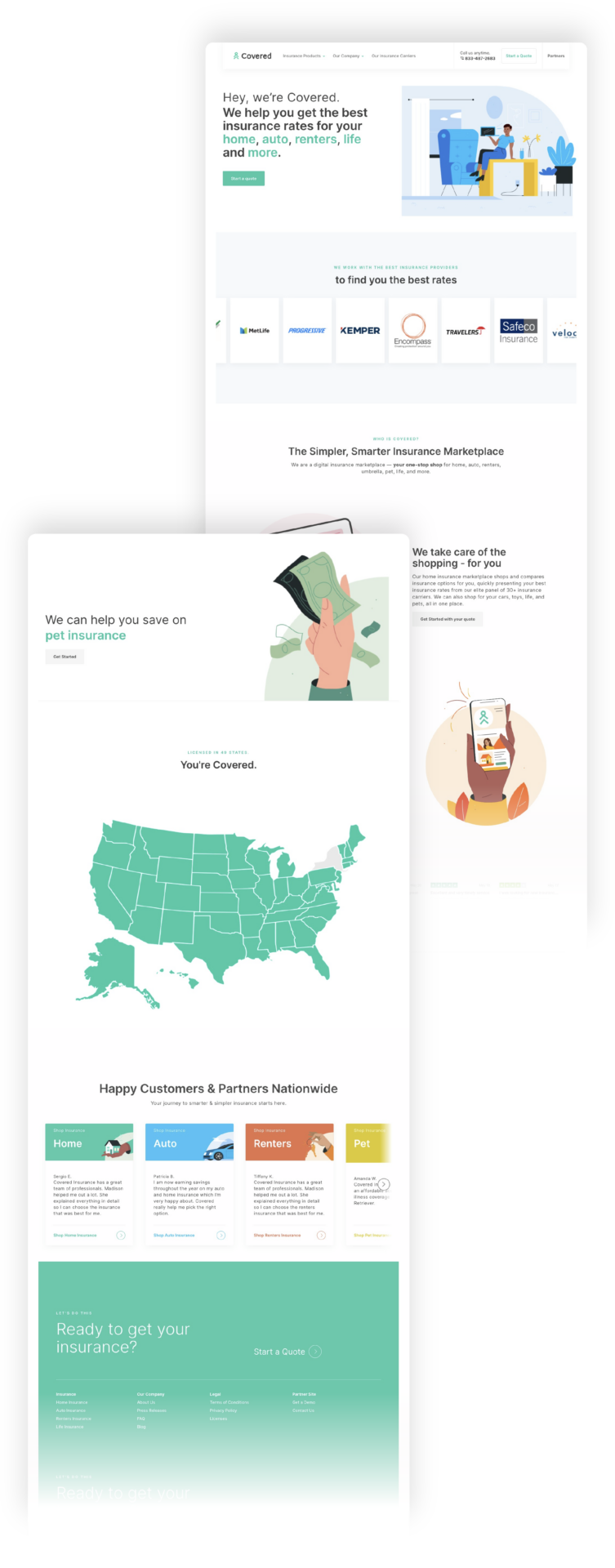
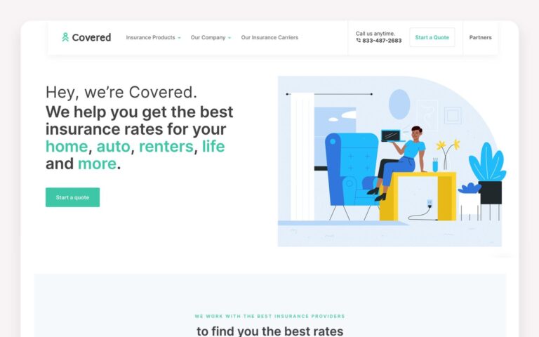

Building a Comprehensive Brand and Dynamic Online Presence
Breaking from Tradition Covered’s brand mark was designed to symbolize support and stability, representing their commitment to making insurance easy to understand and purchase. The identity needed to stand out in a traditionally conservative industry, reflecting Covered’s innovative approach.
Supporting Sales, Marketing, and Executive Leadership
For years, Commence Studio provided ongoing brand support to Covered’s sales, marketing, and executive leadership teams. This included developing targeted marketing materials, refining sales presentations, and ensuring the brand message remained consistent and impactful across all channels. Our partnership extended beyond initial design work, helping Covered maintain a strong brand presence and achieve sustained growth.
Happy and Helpful Commence Studio expanded and updated Covered’s illustrations to align with their growth from a small app startup to a full digital marketplace. The adaptive visual system simplifies complex insurance concepts, making them accessible and engaging. These illustrations are prominently featured across all marketing efforts, including the website, whitepapers, email campaigns, and presentations.
A Diverse Lineup We created a set of characters that reflect community, inclusivity, and friendliness, adding a human touch to Covered’s visual messaging. This approach aligns with Covered’s values and their mission to provide an easier insurance experience for people from all walks of life.
An Online Marketplace As Covered outgrew their old website, we developed a new consumer-facing site that includes general information, a partner portal, and a consumer portal for purchasing insurance. The revitalized website ensures a seamless user experience, enhancing customer engagement.
Flexible Systems To accommodate the expanding range of insurance products, we designed a backend system that allows for the creation of new landing pages for each type of insurance as needed. This flexibility enables Covered to meet growing demand and adapt to technological advancements in insurance purchasing.
Business-to-Business Solutions We crafted a partnership site tailored to Covered’s business-oriented audience. The site highlights transparent insurance options and services, improving customer engagement and satisfaction for insurance companies partnering with Covered.
From Lemonade Stands to Digital Marketplaces
When we first sat with Ross and Chris, the founders of Covered, we were captivated by their entrepreneurial spirit. From childhood lemonade stands to brainstorming business ideas in their hot tub, they had always been driven by innovation. Their frustration with the arduous task of finding home insurance led them to envision a transparent and streamlined digital insurance marketplace.
Initially, we helped the brothers raise funds by building a prototype of a mobile app geared towards millennials. Despite the initial setback with investors not buying into the concept, we pivoted our approach. By focusing on repositioning the app as a tool for loan officers, we found a niche that resonated with the target audience and investors.
Elevated Brand Identity and Enhanced Online Presence
The comprehensive branding, web development, and design solutions provided by Commence Studio played a pivotal role in Covered’s growth and success. The new brand identity and visual systems made complex insurance concepts accessible and engaging, while the redesigned website enhanced customer interaction and satisfaction.
Covered’s new online marketplace and flexible backend system positioned them as a leader in the digital insurance space, ultimately leading to their acquisition. The collaborative efforts between Covered and Commence Studio resulted in increased customer engagement, higher satisfaction rates, and a significant market presence, demonstrating the impact of thoughtful and responsive design.
Client Testimonials
“We’ve received so much more than high-quality design work with Commence Studio. We’ve received friends. We’ve received business partners. And we’ve received coaching and guidance into a completely foreign territory and uncharted lands. We’ll keep Commence Studio as a part of our core team for as long as we can.”
A Partnership Beyond Design
Working with Covered from their early sketches to their successful pivot and ultimate acquisition has been one of Commence Studio’s most meaningful partnerships. By providing not just design but also strategic business advice, we helped Covered transform from a startup with a simple idea into a leading player in the digital insurance market. Our journey with Covered exemplifies the importance of collaboration, innovation, and thoughtful design in achieving business success.
Selling your products or services becomes a heck of a lot easier when your brand identity clearly defines who you are and what you care about and speaks directly to the people that you want to connect with.