Rebranding Nevada’s Oldest Credit Union
Sierra Pacific is Nevada's oldest credit union — founded in 1936, member-owned, never acquired. The brand hadn't kept pace with what the institution had become. We rebuilt the positioning, renamed the brand, designed a logomark rooted in the geography its members actually live in, and shipped a phased internal-first launch that brought 200+ employees and tens of thousands of members along with it.
 Live since 2023
Lost in legacy: an institution older than its identity could carry.
Sierra Pacific Federal Credit Union was founded in 1936 — the first credit union ever chartered in Nevada. Eighty-seven years of trust, three generations of member families, and a balance sheet that outperformed most regional banks. None of which the brand reflected.
The wordmark and color system were category-default credit-union: blue, conservative, indistinguishable from competitors who were a fraction of Sierra’s age and a fraction of its actual member service. The cooperative’s real story — Nevada’s oldest, member-owned not-for-profit, deeply embedded in the small businesses and families who literally built the communities its branches sit in — was buried under a visual language that read “any credit union, anywhere.”
The brief was a full system rebuild: new positioning rooted in the heritage and the contrarian member-first stance, a renamed brand that read tighter and more confident, a logomark that pulled from the geography Sierra actually serves (the trails, peaks, and trees of Northern Nevada), a color palette that broke from the credit-union default, and — critically — a phased internal-first launch that brought every employee, branch, and member touchpoint along without a single Tuesday morning of confusion.
Position the heritage. Zag on the visual language. Land the launch internally first.
Positioning rooted in 87 years of member ownership.
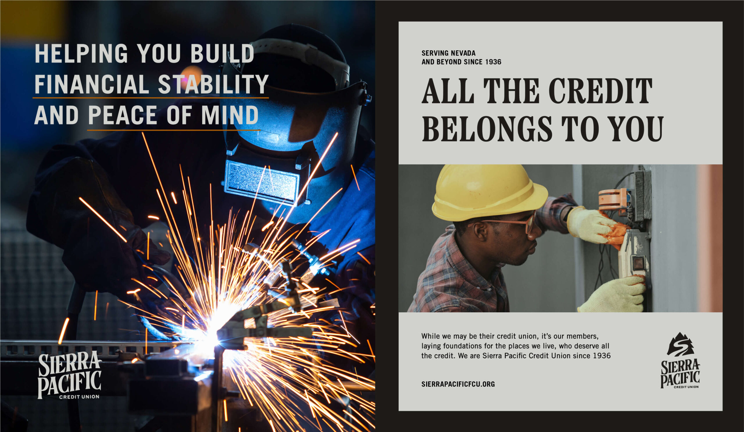
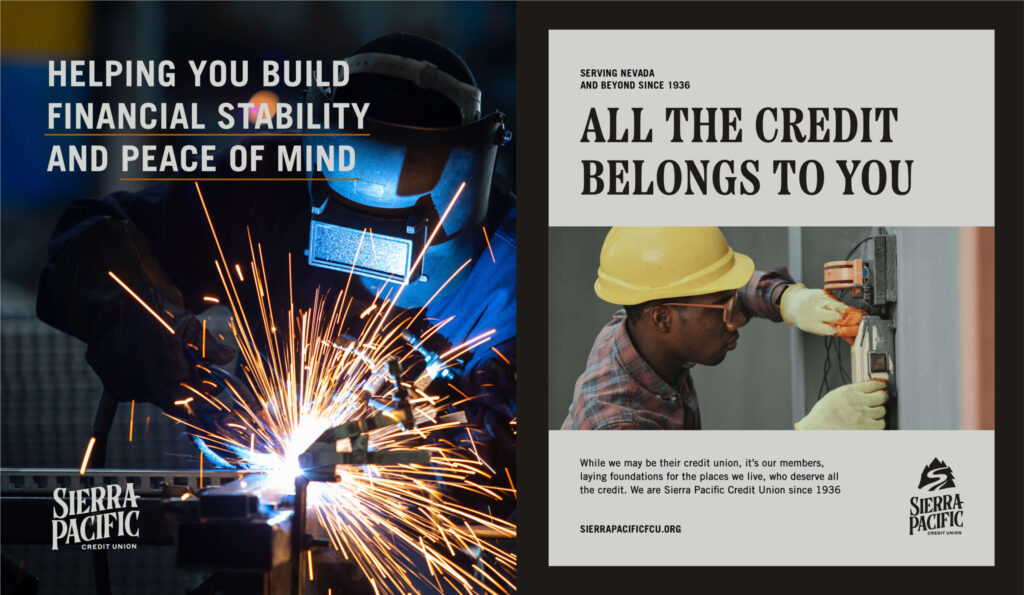
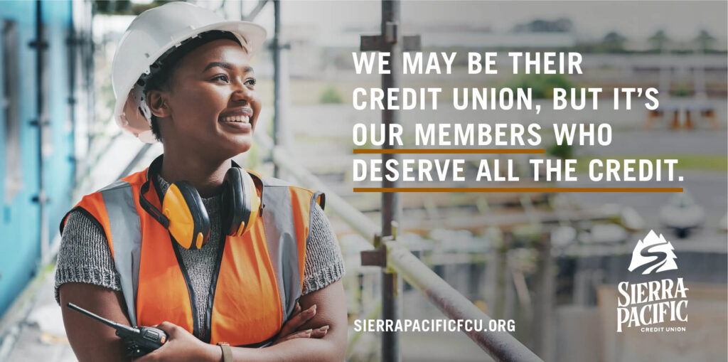
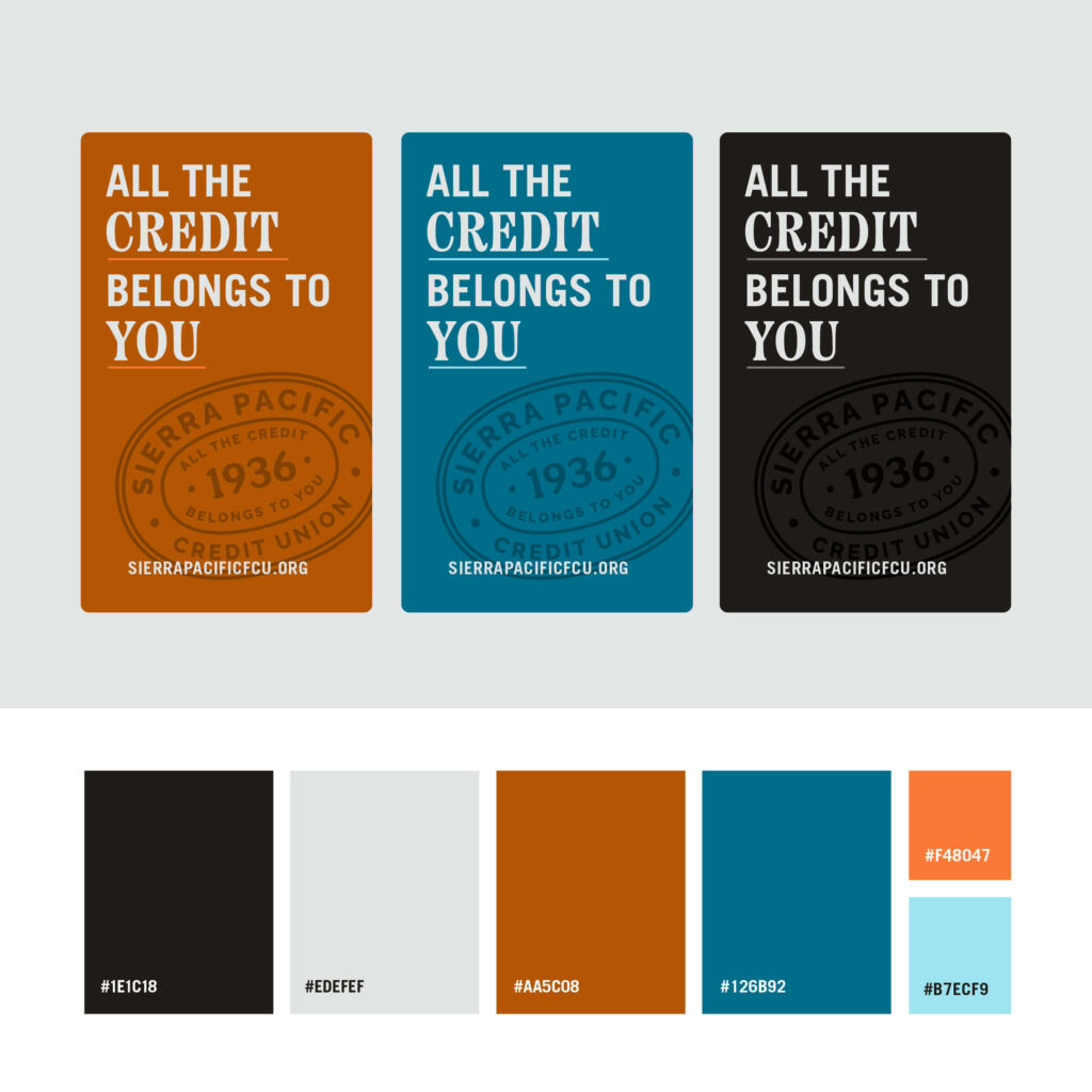
The strategic move was making the heritage the positioning. Sierra is Nevada's first credit union — member-owned since 1936, never acquired, never demutualized. We turned the longevity into the differentiator (high-touch service, deep community roots, locally accountable) instead of just a "founded in" line. The brand mantra: All the credit belongs to you.
A renamed brand that read tighter and more confident.
Sierra Pacific Federal Credit Union → Sierra Pacific Credit Union. Dropping "Federal" tightened every signage execution, shaved seconds off every member-service call, and let the wordmark breathe. Sierra remains a federal-chartered NCUA-insured institution — the regulatory status didn't change, the verbal load did.
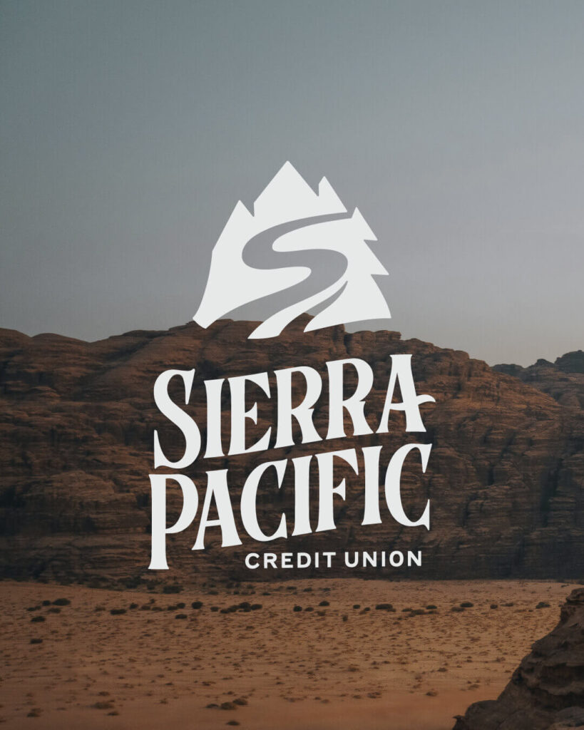
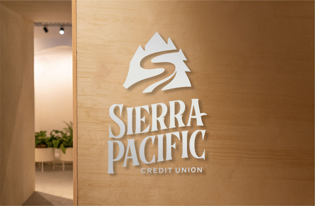
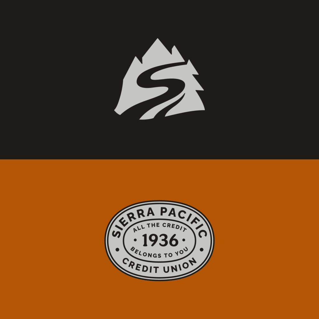
A logomark drawn from the geography Sierra serves.
Custom mark with four embedded symbols: a trail forming a clear S (history, journey, pioneer), trees (rooted, stability, down-to-earth), peaks (experienced, excellence, strength), and a stream/shadow (steadfast, dedicated, attentive). Northern Nevada's landscape encoded into the institution's mark — locally specific instead of generically financial.
A contrarian color system that broke the category default.
Every credit union in the market was zigging to blue. We zagged. Warm Black, Bronze, and Steel Blue accents — sophisticated, confident, distinctly not-bank. The bronze served as a flag at distance (signage, ATM wraps, app icons) where members spot a Sierra branch from across a parking lot in a way they couldn't before.
Internal launch first, public launch second.
A rebrand fails if the front-line team can't answer the questions. We ran a soft launch on July 20, 2023 — internal-only — that walked every employee through the brand book, the FAQ, the messaging, and the talking points before a single member saw the new mark. Hard launch August 18 followed with branch signage, web, app, email signatures, social, business cards, and the merchandise refresh shipping in lockstep.
A blueprint that survived past the launch.
Beyond the launch we shipped Sierra's in-house team a Brand Team Guidebook (17pp), an SEO improvement plan, a complete brand asset library, photography guidelines, copy voice principles, and the post-launch measurement framework against five named goals. The marketing team now ships executions on the brand without us in the room.

Businesses that work with us keep leaving comments that they enjoy the new brand!
Katie Mills · CMO, Sierra Pacific Credit Union
Numbers that matter for a heritage rebrand.
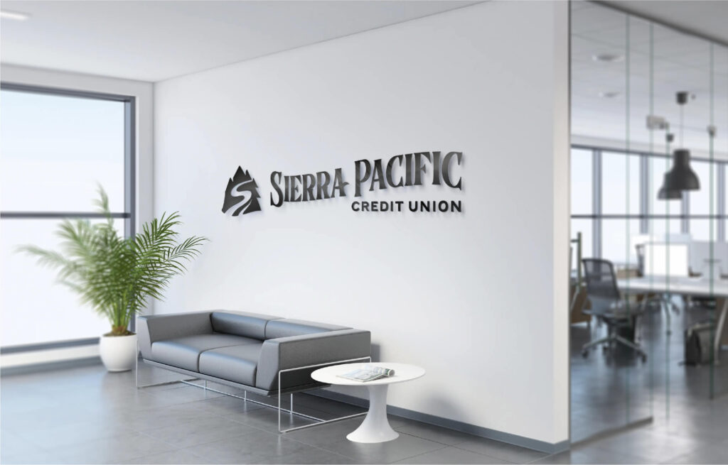
Identity, signage, and member touchpoints — in production.


Businesses that work with us keep leaving comments that they enjoy the new brand!
Like what you see? Let's talk about your commerce stack.
A 14-day strategic diagnostic — we audit your current stack, identify the friction worth fixing first, and ship a phased plan with sized investments. Fully credited toward an engagement if we move forward together.
What you walk away with
- ✓A measured map of every friction point in your current commerce flow
- ✓Three phased options — minimum, considered, comprehensive
- ✓Sized investments and timelines, no aspirational ranges
- ✓A clear "don't hire us if…" section. We mean it.
