

The Lead Designer behind this project, #girlboss Brianna Bullentini reached out to us at Laxalt and McIver to take the reins on creative direction and branding to help take her vision to life. The goal: create a community hub where people can gather, shop, eat, drink and enjoy and do it in a way that acknowledges the history and strength behind each individual shop within the space
A Community Hub Down Under
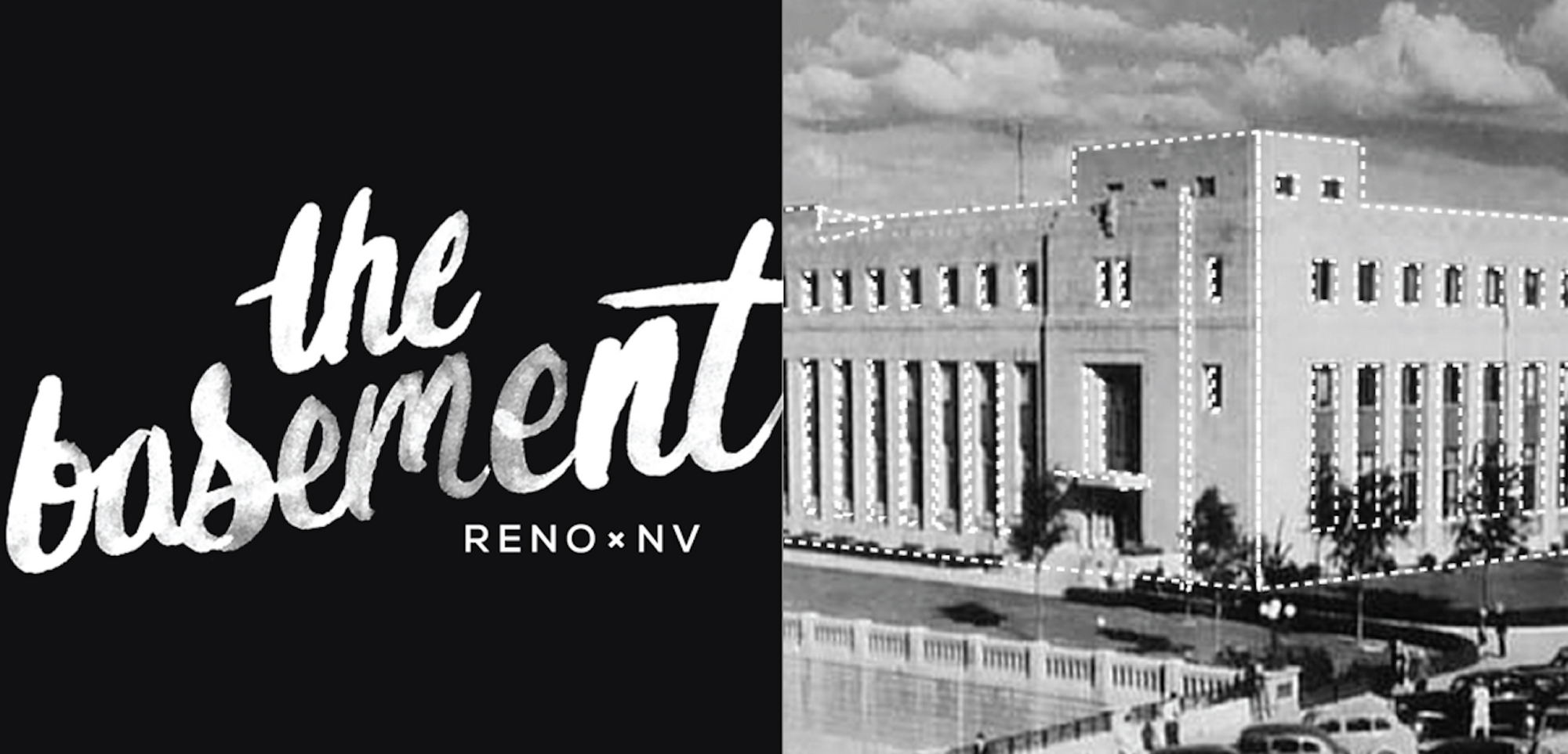
The Basement
One historic abandoned building, big dreamers and passionate creatives, and blood, sweat and cold pressed juices later - we’ve got the concoctions for either a 21st century West-Coast horror film, or the start of the workings of the Basement.
Creating Community
A local renovation
What a city cries for is the means for people to gather easily, inexpensively, regularly, and pleasurably- a place to meet, a real life alternative to television, an easy escape from the cabin fever of the office or home.
One thing that stood out to us, was how many different moving parts went into the Basement.
How can we create a cohesive look for a clothing boutique, a salad bar, a juice bar, and whatever other shops may happen to go into the Basement. Also, how does this work together with the installation of the first major retailer in downtown Reno in over 30 years?
To start creating a cohesive feel, we had to look at the similarities of all the different shops and boutiques that would be filling up the space… and the most common element? Their location.
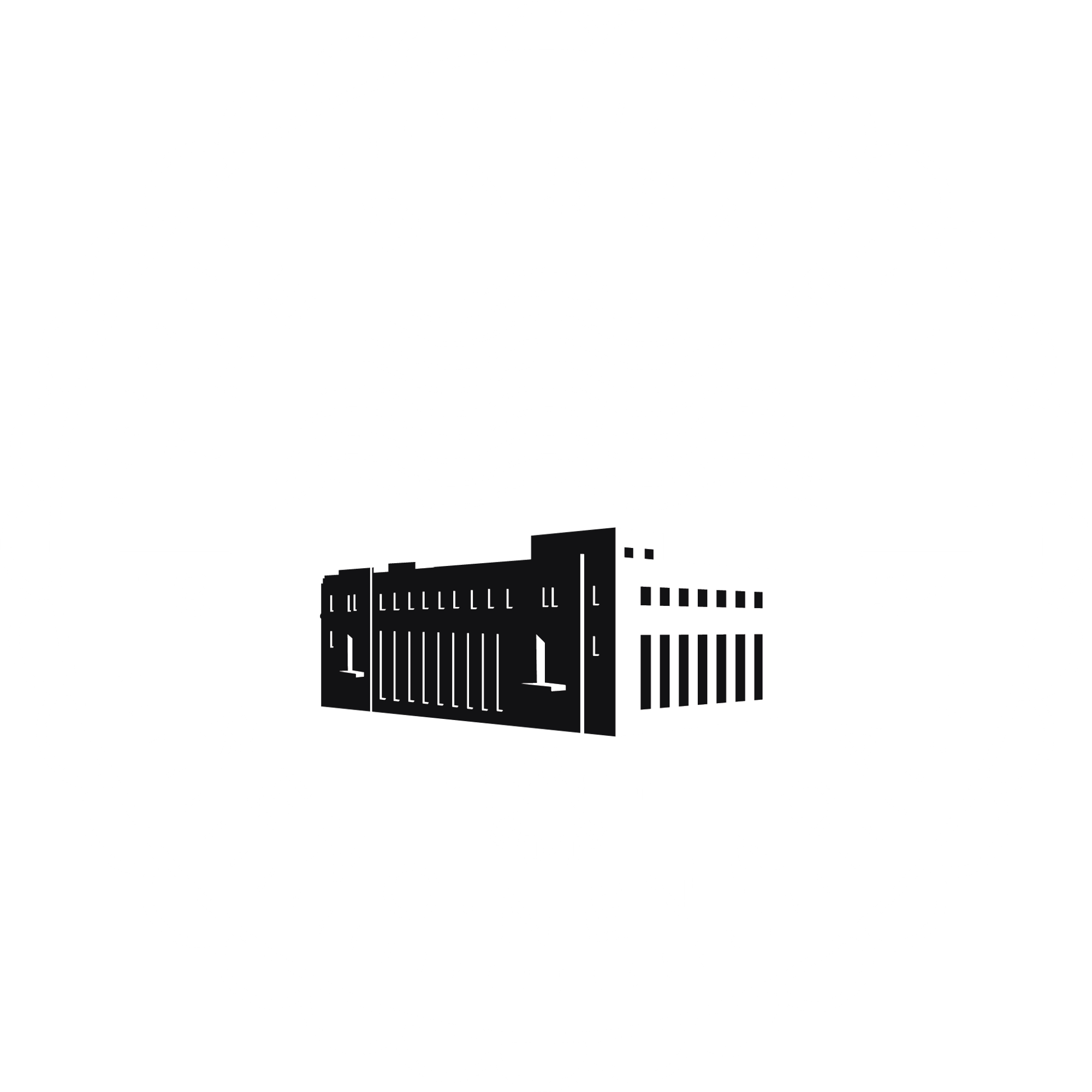
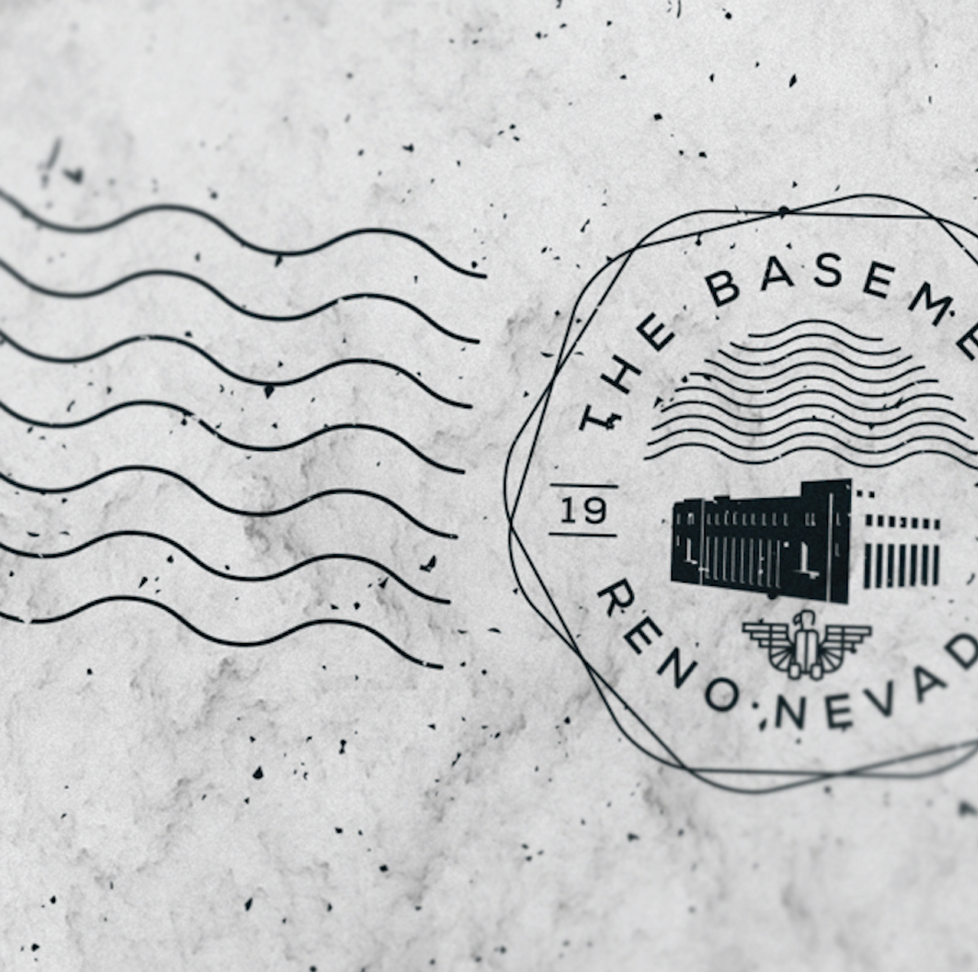
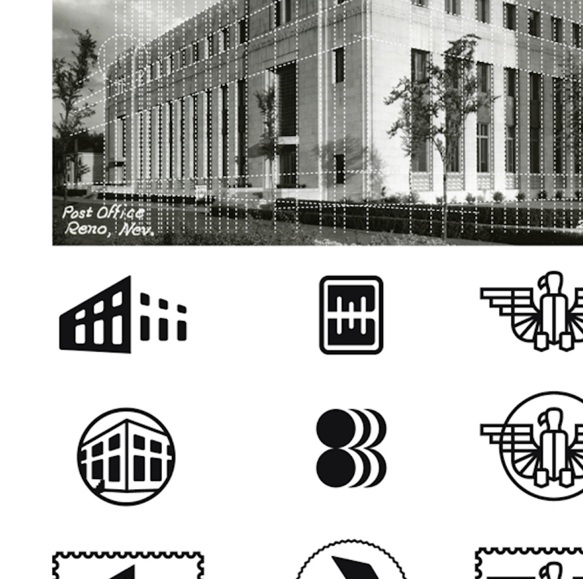
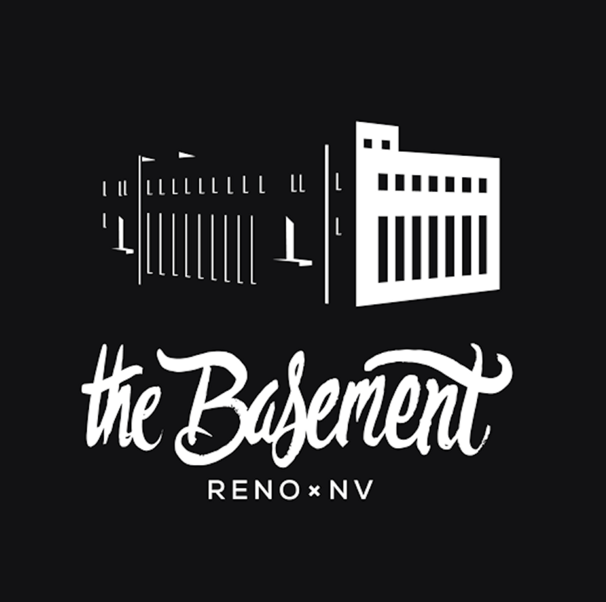
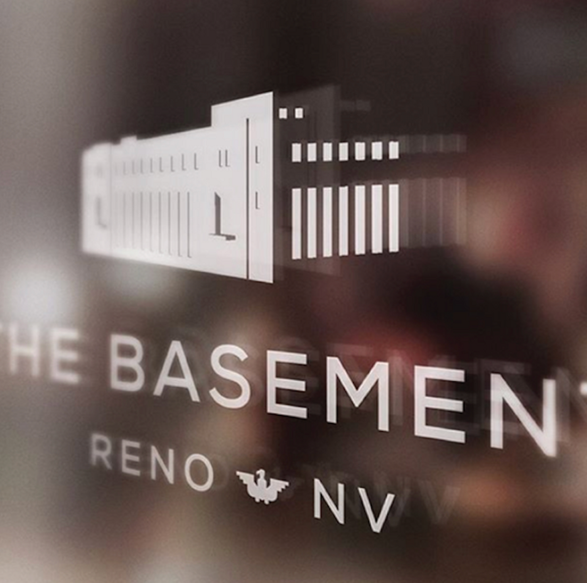
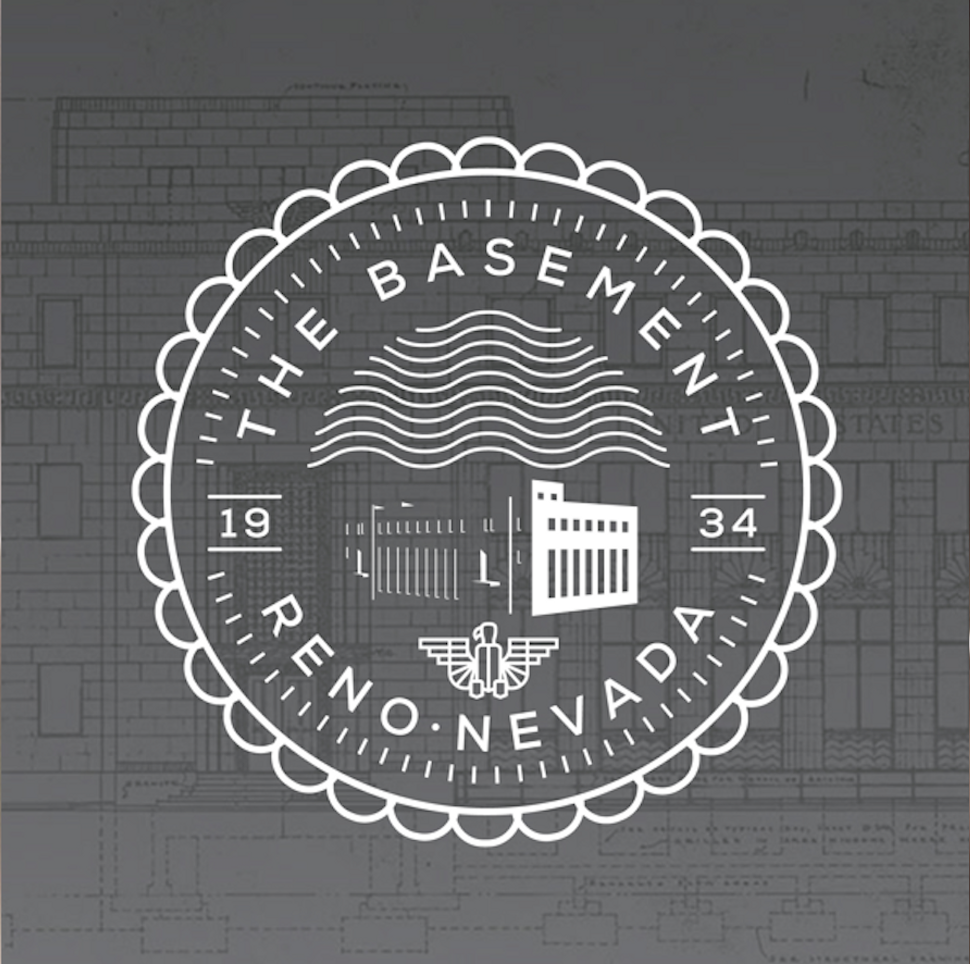
Bullentini was adamant that we bring out the natural feel of the space - a United States Post Office from the 1930’s, thats rad. A big emphasis was not on covering it up, but rather bringing out the best of it. Highlighting the historic beauty - bingo we found a starting point.
This multifaceted gem needed something to bring out it’s natural elements.
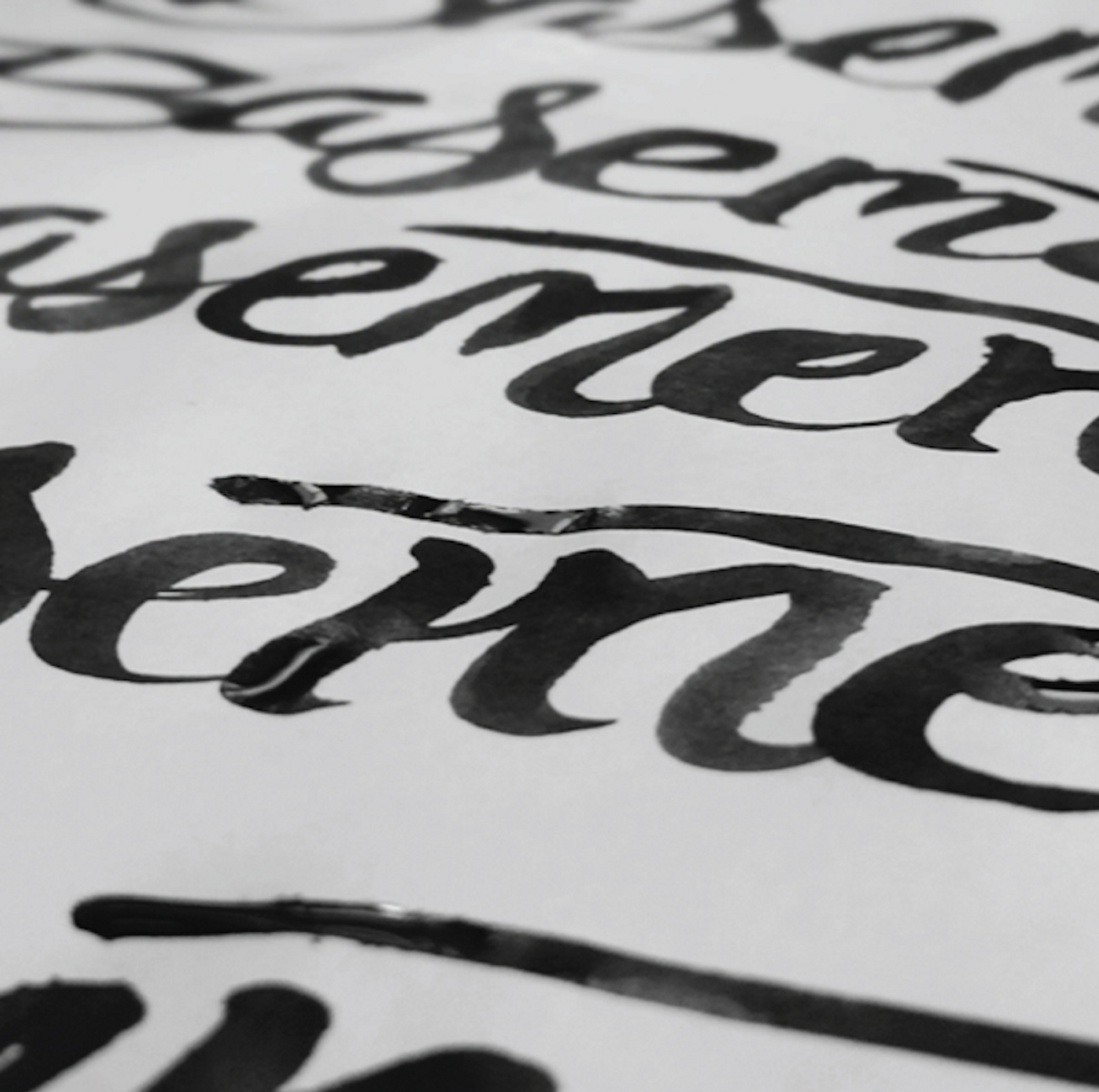
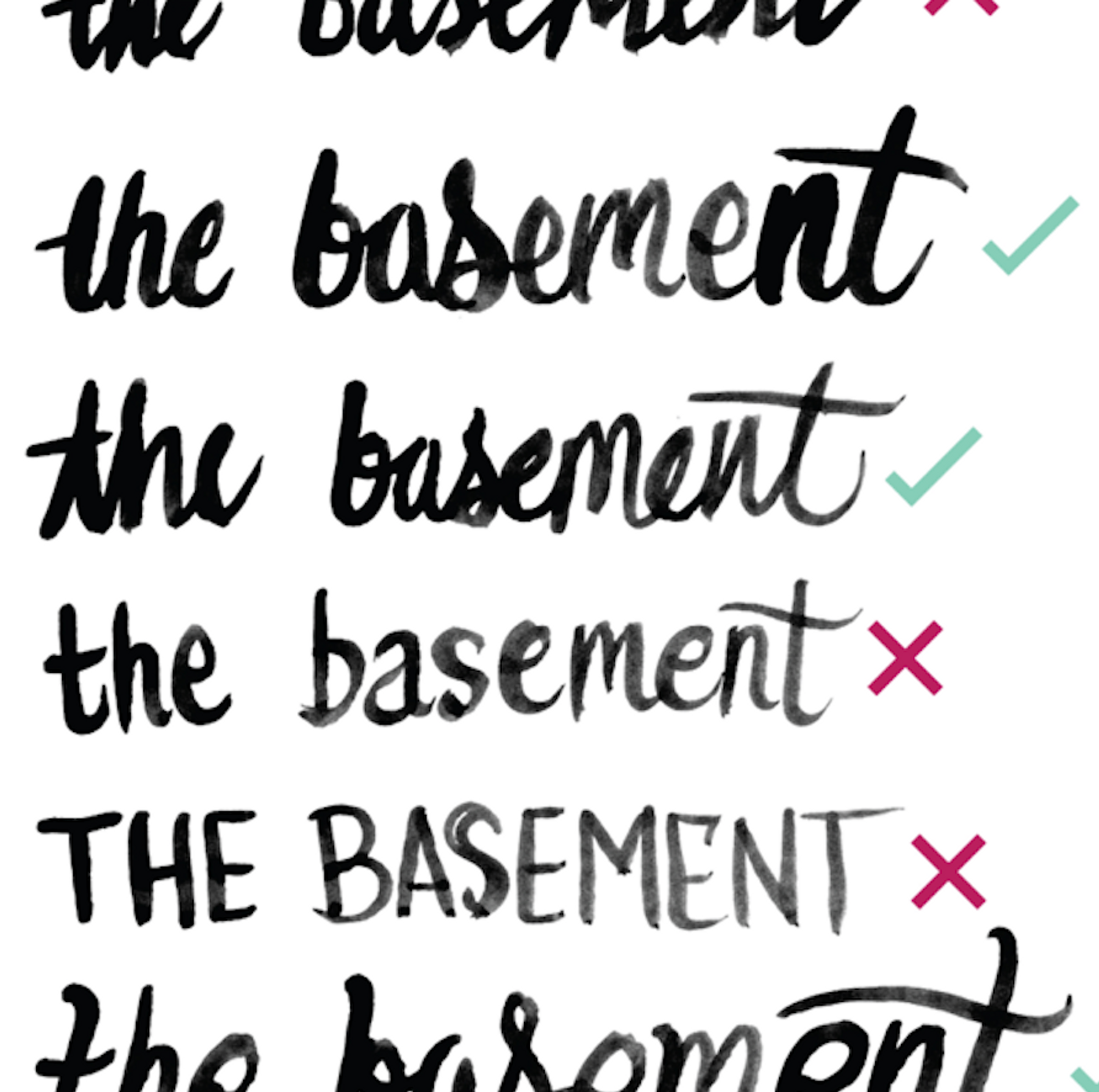
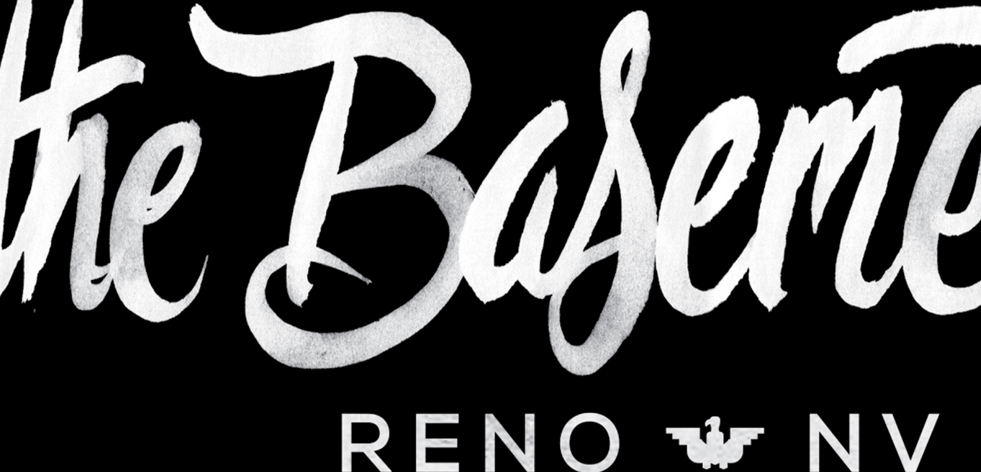
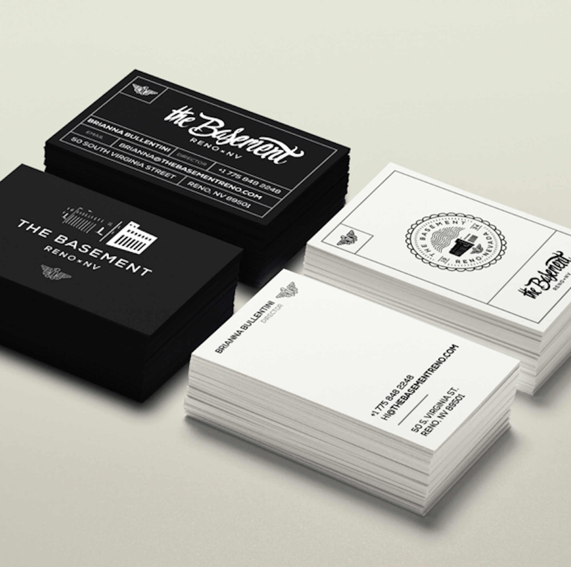
A super buttoned-up, identity wasn’t going to do it here. Using the shape of the building, in combination with hand-lettered details, we were able to create a logotype that was modern, yet pulled the original historic elements from the space itself.
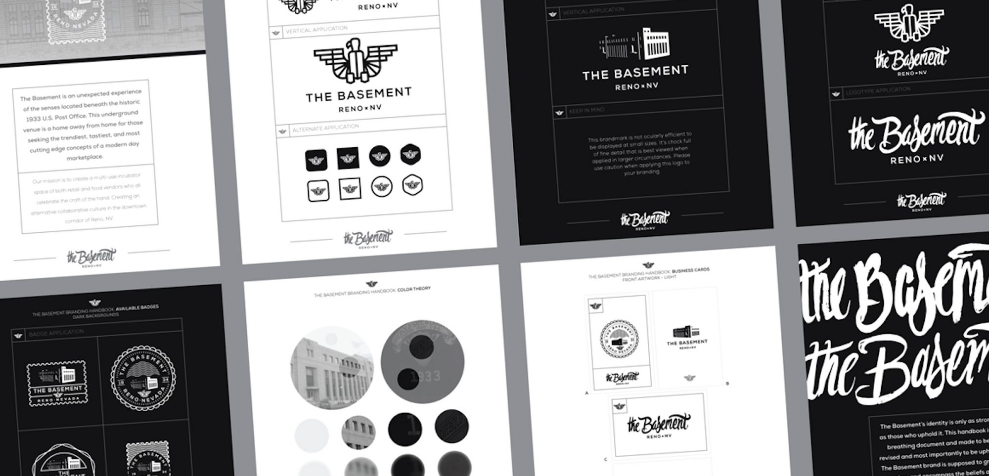

"The hand-lettered details and linework can be seen throughout the space and it provides a contrast of the clean, modern look alongside a historic setting."
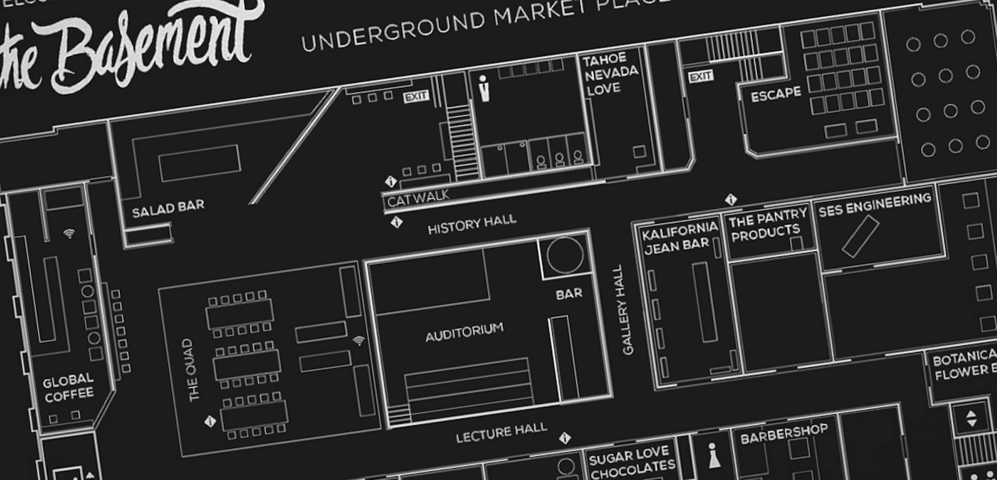
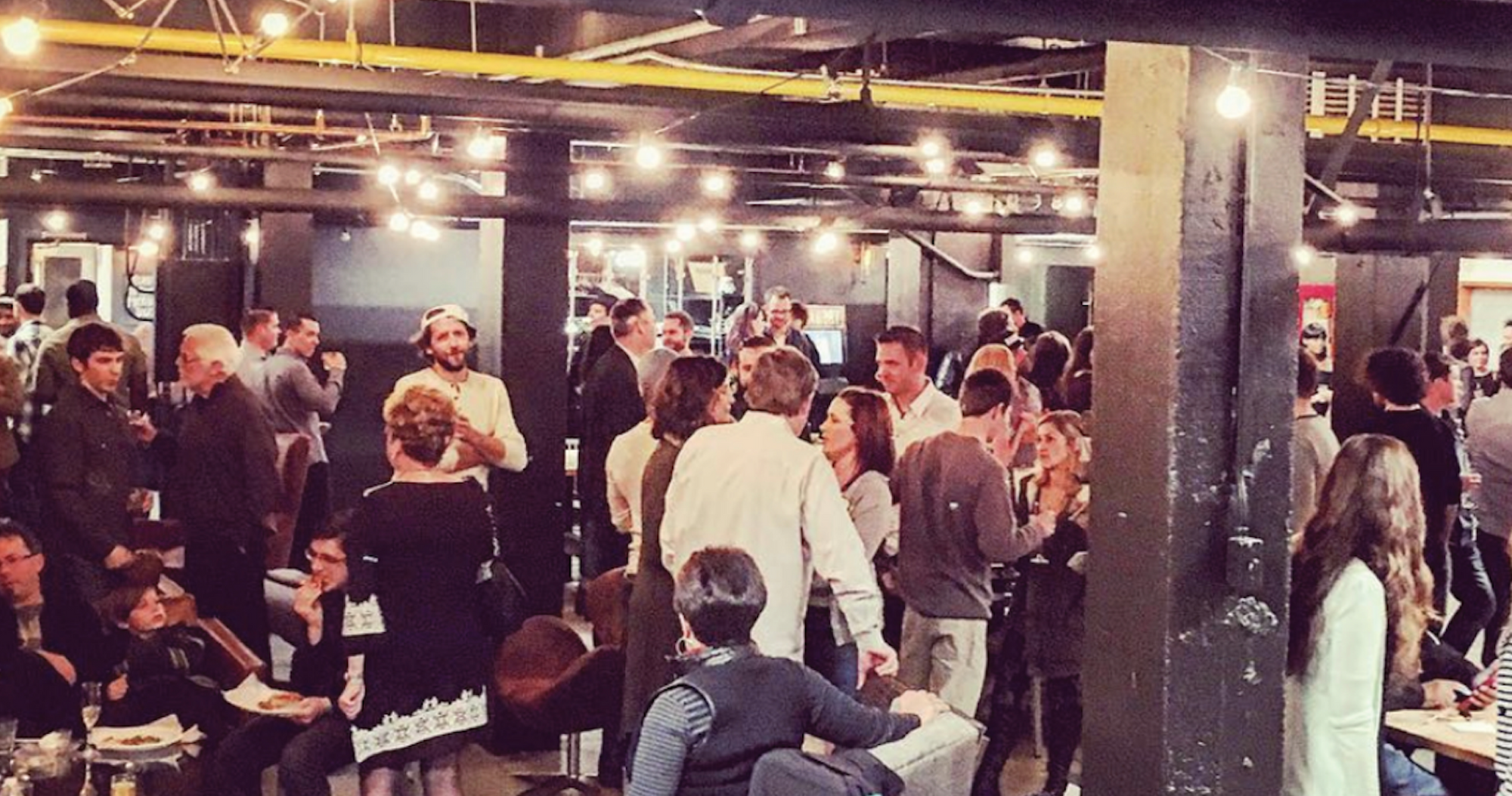
Now, three years since it’s inception - the Basement is home to many different local boutiques, retail stores, and even a gym.
It’s captured what Bullentini has set out for it to be - a gathering place for people to come together, and celebrate life. Here's a quick overview of other projects in the Basement the L&M team got to get their hands on:
Cold-Pressed Juice Bar
Rawbry
Working with the Rawbry team, we were first tasked with creating a menu design and bottle packaging that reflected their bold and edgy style. From there, we also helped to create store signage (including a sweet in-store neon sign), print collateral, and eventually redesigned the bottle to be more economical and sustainable as the brand grew and expanded.


Inspiring Adventure
Tahoe Nevada Love
Long time partners and friends of L&M, Tahoe Nevada Love is a homegrown team that focuses on the boundless adventures and experiences both in and around our beautiful Lake Tahoe. A lifestyle brand at heart, we helped TNL create products that were both unique and fashionable. Everything from their warm winter lines, bright beach attire, drinkware, backpacks and adventure gear were made to reflect their love for the lake.
Bites By Design
Chomp
Paying homage to the post office's architect, Frederick J. DeLongchamps, the branding and identity we established for Chomp combines sophistication, structure, with warm and welcoming vibes. With a focus on quality, organic, and local food, everything from the menu, print advertisements, and promotional assets were consistent in showing their clean and refined look.
